Joshua Harrell
5 min read

Here's a little experiment I love, mostly because it's humbling. Hand your phone to someone who's never seen your website. Open your home page, count to five, and take the phone back. Then ask them two questions: Who does this advisor help? How would you get in touch?
If they can answer both, your website is doing its first job. If they shrug, smile politely, and say something like "travel stuff," you've just found the most valuable fix on your entire site.
Why Five Seconds Matters So Much
Most travelers do their homework before they ever contact an advisor. A friend mentions your name, or you come up in a search, and they look you up—often on a phone, often at night, often while half-watching something else. In those first few seconds, they're deciding one thing: Am I in the right place?
They aren't reading your full story yet. They're scanning. Your headline, your photo, and your first button do almost all the work. That's a lot of responsibility for a few square inches of screen, which is exactly why it deserves your attention.
The Four Questions Your Home Page Has to Answer
Before a visitor scrolls, your home page should answer four questions.
Who do you help? Name them. Couples, families, groups, luxury travelers, first-time cruisers. "Everyone who loves travel" is not a who.
What do you plan? Name the trips and places you know best—not a list of everything you could technically book. Specific is memorable, and memorable gets referred.
Why trust you? A real photo of you, a line about your experience, a short testimonial, and any credentials or awards. Trust is built in small signals, not in one big claim.
How do I start? One clear button above the fold. "Start Planning Your Trip." "Book a Discovery Call." One button, not five competing links that all feel equally important.
Write the One Line That Does the Heavy Lifting
If you only change one thing this month, change your headline. Try this formula:
I help [who] plan [what kind of travel] so they can [the outcome they care about].
"I help couples plan honeymoons in the Mediterranean that feel personal from the first night to the last." Read that out loud. A couple planning a honeymoon hears it and leans in. Someone looking for a corporate retreat planner knows to keep looking—and that's a good thing. Being specific doesn't shrink your business. It makes you easy to remember and easy to recommend.
The same sentence helps Google and AI tools understand when to show you, too. One line, working for people and search at the same time.
Clear the Clutter Around It
A great headline can get buried. Look at your home page with fresh eyes and check five things:
- Navigation has five or six plain labels, like About, Trips, Testimonials, Blog, and Contact
- The layout works on a phone first, because that's where most visitors arrive
- Text is short, spaced out, and readable without zooming
- Photos are real, high quality, and match the travel you actually sell
- Every page ends with one clear next step
That last one trips up a lot of us. If your page ends with a nice paragraph and no button, you've walked the traveler right up to the door and left them standing on the porch.
What Belongs Right Below the Fold
Once a traveler decides they're in the right place, they scroll. Reward that. Right under your headline, give them three quick proof points: a short line about the trips you know best, one testimonial with a first name and the kind of trip, and a photo of you that looks like the person they'll actually talk to. Then repeat your button. Nobody should have to scroll back up to find out how to start.
Speed Is Part of the First Impression
Five seconds goes fast when a page is still loading. If your hero photo takes three seconds to appear, you've spent most of your first impression on a blank screen. Run your home page through Google's free PageSpeed Insights tool and check the mobile results. Oversized photos, autoplay video, and stacked-up plugins are the usual culprits, and most of them are fixable in an afternoon.
Frequently Asked Questions
What should a travel advisor's homepage say in the first five seconds?
Who you help, what you plan, why a traveler should trust you, and how to get started. A one-line headline—"I help [who] plan [what kind of travel] so they can [the outcome they care about]"—does most of that work.
How many calls to action should a travel advisor homepage have?
One clear button above the fold, such as "Start Planning Your Trip" or "Book a Discovery Call," not five competing links that all feel equally important.
Does a specific headline help with Google and AI search?
Yes. The same sentence that tells a traveler who you help and what you plan also helps Google and AI tools understand when to show your business.
Make It a Habit, Not a Project
Your website isn't a brochure you print once. It's closer to a storefront window—it works best when someone tends it. Run the five-second test every quarter, with a new person each time. Your niche will sharpen, your best testimonials will change, and your home page should keep up.
This is quiet, steady work. Wabi Sabi reminds us it doesn't have to be perfect to be powerful. It just has to be clear.
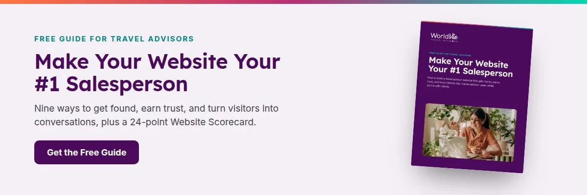
We built the five-second test, plus eight more ways to make your website sell, into a free guide called Make Your Website Your #1 Salesperson. It comes with a 24-point Website Scorecard you can run every quarter.
So who's going to be holding your phone this week—and what do you hope they say after five seconds?